This is a paper I am presenting at The Politics of Reception – Media, Policy and Public Knowledge and Opinion at Lancaster University, April 20th and 21st 2016.
The slides go into possible responses in more depth. They are available here.
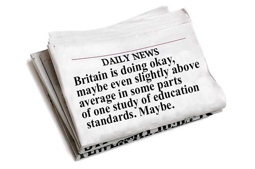
All the data that’s fit to print: an analysis of the coverage in national newspapers of the 2013 PISA Report.
Megan Knight, Associate Dean, School of Creative Arts, University of Hertfordshire.
Data is increasingly part of the public discourse, and how public bodies present information to the news media (and through them, to the public). Drawing on previous work on the subject (Knight, 2015), this paper analyses the presentation of one set of this data in the media, and is working to develop possible responses on the part of the data’s authors.
A total of 34 articles were analysed, from ten news outlets, including websites. Coverage ran over over a week, with the first article running before the release of the report, on December 1st, and the last on the 6th. The full text of the articles was retrieved from Nexis, and letters to the editor and duplicates were removed. Articles came from both the print and online outlets of the various news organisations.
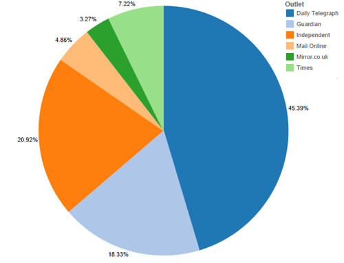
The Telegraph published the most articles, 16, including an online feature that contained within it nine short pieces, each highlighting an aspect of the results. The Guardian and the Independent had seven articles each, The Times three, and the Daily Mail and Mirror one each. By word count, the ratio is similar, although the Daily Mail article was twice the length of that of the Mirror, so it is a larger proportion of coverage.
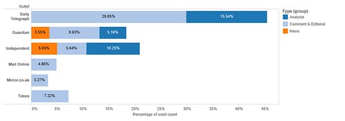
What is more interesting is the nature of the coverage. 53% was editorial or commentary, 19% analysis and only 28% was straight news reporting. Only two outlets, the Guardian and Independent, had a single report that simply announced the results, without comment or analysis. Only the Telegraph, Guardian and Independent reproduced any part of the data included in the report.
On analysing the overall coverage, an initial read-through of the Pisa Report was conducted (OECD, 2013), and the key concepts from the report were identified and tabulated. These might be expected to appear in the coverage of the report and are as follows: The range of subjects covered by the report, including Maths, Reading, Science, Problem Solving and Financial literary; Gender bias evidenced by the data; socio-economic factors that had an impact on performance; the relationship of the results to economic growth; the proportion of immigrant children in the classroom; the importance of motivation and culture to performance; expenditure on education; stratification of education (streaming) and teacher compensation.
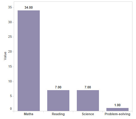
Of the four sections on the test, only one, Maths, was discussed in all the reports, Science and Reading were discussed in seven, Problem-Solving in one, and none of them mentioned Financial Literacy, a new area of study for the PISA report. 26 of the reports, 76% of the whole, only discussed the maths scores, and implied that the test was simply one of mathematical literacy. Of the eight that did discuss other aspects of the test, five did so in less than a sentence. The one report that did discuss problem-solving, an area of the test that the UK did well on, was an opinion piece by a Hong Kong schoolteacher, discussing concerns that future entrepreneurs in the city were being stifled by rote learning and test-taking in favour of softer skills.
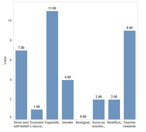
Coverage of the section of the report that discusses the relationship between the scores and other factors, including gender, socio-economic factors, economic growth, immigration, the culture of learning, expenditure on education, the stratification of the education system and teacher compensation was then analysed. Expenditure was discussed in eleven of the articles, in two, the implication was that the UK should spend more on education, in the others, the implication was strongly that the UK’s relatively low standing was despite its high spending. This is interesting, because although the UK spends a relatively large amount to educate each child (ninth in the rankings), the amounts are not adjusted for actual purchase value of currency, and the link was often presented in a negative light:“extra spending is no guarantee of higher performance, good news in an era of austerity” (Barber, 2013) Teacher rewards (financial and status) were mentioned in nine reports, but only one linked the UK’s performance with these issues in the UK.
The culture of education, including the drive and motivation of students was mentioned in seven reports, most often as a reason for the success of Asian countries. Gender was discussed or mentioned in four reports. Stratification and socio-economic factors were mentioned twice each, and immigration was never mentioned at all.
But, it is clear from the analysis that presenting the results of the Pisa report was not the main focus of the coverage. More than half of the coverage was in the form of editorial (written by the news organisation’s staff) or commentary (written by guest columnists). Ten of the articles explicitly politicised the issue, blaming the results on either the then-current government, or on the previous one. Fifteen of the articles presented the results in a negative light, using phrases such as “Britain is failing”, “fall down education league”, “stuck in the educational doldrums”, and “going backwards”. This despite the fact that the results are ambiguous, the UK’s ranking had increased slightly overall since 2009, and the country had done well on at least one measure of the test, problem-solving.
Eight of the articles presented the idea that Asia is “winning” the educational contest (as though education is a zero-sum game), in contrast to the UK’s “losing” of the same contest. Again, this is despite the fact that several non-Asian countries outperformed the UK as well.
Only three stories offered any critique of the study. Critiques were focused on the use of “plausible data” to fill in gaps and on the selection of Shanghai as a testing location. Minor critique was offered in two other articles, in the form of a caveat “academics question the validity of the test”, and four more criticised the ways in which various societies respond to the findings, accusing the test of effectively narrowing the range of debate on education policy and reinforcing a culture in which one’s maths scores are paramount. In only one of these articles did the journalist engage specifically with the data, and conduct their own analysis.
This politicisation of the issues is presented in line with the known political bias of the newspapers in question – the data was framed almost entirely in the context of the political landscape and the impact of the coalition government’s reforms of the education system in the UK.
None of this is surprising: education policy is highly political, and new information that reflects on that policy will inevitably be turned to political ends. The rhetoric of failure, of international standards as competition with winners and losers, and of the threat of economic (and possibly other) damage which may be wrought by China are established tropes in the UK news media, and the coverage here falls into a familiar pattern of blame and self-criticism.
So, what does this mean for academics and people working with this data, and wanting to ensure fair and useful coverage in the media? Much of the material below is based on well-accepted research into news values (Galtung and Ruge, 1965; Harcup and O’Neill, 2001), which discussed the ways in which news organisations make choices of stories and angles.

Journalists are superficial thinkers.
This is not an insult. Journalists tend to have a very wide range of knowledge and expertise, and to pick things up very quickly, but the converse of that is that they do not have the time (or often the inclination) to develop expertise and in-depth understanding of information. The report was released on December 3rd, and the first reports appeared the same day. Even allowing for early release to the media, it is likely that the journalists had only a day or two with the report, whose short form is 44 pages long and contains dozens of detailed and complicated tables, before needing to file their stories.
Every news organisation leapt on a single key point: the maths scores. This is in keeping with the main thrust of the report, and also with previous reporting on the issue. Since the report was expected, it is also likely that the news organisations prepared much of the material in advance, lining up experts and commentary before they knew what the results would be.
Journalists (and readers) are uncomfortable with ambiguity.
Although the results are subtle, and the question of whether the UK has risen or fallen in the rankings is a complicated one, the final message was presented as a simple failure to improve. This is partially the result of the politicisation of the issue, partly the need for clear headlines.
Research is seldom simple, and the news media’s taste for unambiguous results and simple statements makes journalists and academics uncomfortable bedfellows. Academics are often frustrated with what they see as misrepresentation, and journalists with what they see as waffling or prevarication.

Journalists are frightened of data.
The fact is, maths and data scare journalists, who tend to be drawn from the ranks of those who hated maths at school. The way in which data are presented in reports like the PISA report is particularly complicated, for academics, it can be hard to realise that any representation of data containing more than two value scales is baffling. [Insert figure 11.1.2 from p 14 of the report].
The stories were based almost entirely on the text contained in the press release and the narrative of the report, any information not conveyed in a simple skim of the report was not present in the coverage.

Journalists rely on other people.
Journalists are trained not to voice their own opinions. The convention is still to use third parties, expert voices and commentary, to present arguments in a story. Obviously the journalist has control over who they interview, and can privilege one opinion over another in this process, but in practice, comment tends to come from the people the journalist knows and can trust to provide what is needed, in the right time frame. Researchers and academic staff are commonly used in interviews, and often actively court relationships with journalists.
In addition, some 40% of the articles presented were not written by journalists, but commissioned from experts and interested parties to present a range of perspectives and voices. This form of writing can be an excellent vehicle for academics and researchers to raise their profile and present their own research, again, provided they work within the known parameters of the news organisation.
Conclusions and issues.
- Small increase in data journalism and data journalists
- Costs and specialisations
- Impact on policy
- Cherrypicking and retrospective justification
- Do journalists really matter?
- Direct access to public opinion via social media
Works Cited
Galtung, J., Ruge, M.H., 1965. The Structure of Foreign News. J. Peace Res. 2, 64–91.
Harcup, T., O’Neill, D., 2001. What Is News? Galtung and Ruge revisited. Journal. Stud. 2, 261–280. doi:10.1080/14616700118449
Knight, M., 2015. Data journalism in the UK: a preliminary analysis of form and content. J. Media Pract. 16, 55–72. doi:10.1080/14682753.2015.1015801
OECD, 2013. PISA 2012 Results in Focus.