Researching Facebook: ethics, techniques and discussions.

This paper is a discussion of the methods used in Examining the Social Media Echo Chamber (Knight, 2017, in progress) and in the research discussed  at http://www.meganknight.uk/journalism/social-media-research-project/ and http://www.meganknight.uk/researc/social-media-research-methods/. The paper is intended to highlight and open for discussion the issues surrounding social media research and its place in current social research.

The importance of researching news on social media

I was sitting in a panel discussion in July of 2016, listening to a series of papers on the media’s coverage of the 2016 UK Referendum on membership in the EU (Brexit) and the role this had played in the result, which was a surprise to many people (apparently even to the people who had campaigned for it). As is typical of media analysis, especially in the UK, discussion focused on newspapers and broadcast media, with a few mentions of Twitter. The researchers had all focused on print newspapers, not on online news sources, and none had considered how news content was targeted and shared through social media, when discussing how it had promoted and responded to Brexit. In fairness, the wider publication (Jackson et al., 2016), did include discussion of social media, but not of social media as the locus of news media – journalism and social media were discussed entirely separately. .

Social media has been extensively  researched since 2005, and as with all new media, the research has gone through phases, First, there is description and evangelising (Gant, 2007; Gillmor, 2006; Weinberger, 2007) – the focus here is on explaining the new medium and arguing for how it will change everything. The second phase is analytic, examining the new medium in detail, and comparing it with old media – (Knight, 2013, 2012; Knight and Cook, 2013). The final phase is normalisation, in which the new medium is simply absorbed into all discussions of media, and its place is assured as simply one of many media.

New media and social media should be moving into this phase, based on the overall usage and penetration of these forms of media (Gottfried and Shearer, 2016), but the rapid expansion of social media into the public sphere has left many researchers playing catch-up with  a technology that is moving faster than the academy can track it, and social media (and new media) present many specific technological challenges to conducting research into its content.

Most researchers conducting content analysis into the news media either collect physical examples, or use one of the standardised archives of news content (for newspapers this is usually Nexis, which archives the textual content of thousands of newspapers worldwide, and is readily accessible to most academic researchers). Broadcast media is more complicated, requiring the setting up of recording of broadcast shows, but still technologically straightforward. (Berger, 2011; Löffelholz and Weaver, 2008). Social media research methods are neither standardised, nor technologically straightforward and this presents specific challenges.

To start with, there is the problem of boundaries – how does one determine what social media content is news, and what is not? This is a more nuanced discussion than this paper has scope to consider, but it ties in to the fundamental collapse of professional boundaries which is the hallmark of the new and social media age (Gant, 2007; Knight and Cook, 2013). The second challenge is technological – how do you access and store social media content. Research requires that content be fixed and accessible, in order to allow for repeated viewings and analysis, and social media is by its nature fleeting and impermanent.

Social media sites allow for public viewing of content, but control the platform through which the content is viewed, and seldom allows for storage of content for later consumption or analysis. Social media companies grant more extensive access to the platform through an application programming interface (API) which allows for software tools to be written which can access and download the content for analysis. Different companies offer different facilities through their API, and many of them control access or charge for it, considering access to the raw and customisable data feed of social media as economic product.

The API is a fairly simple tool to use, but few media researchers have any programming skills. It will take a generation before knowledge of programming languages and the ability to write applications to access and analyse data becomes standard within media studies, and this makes researching social media more expensive and time-consuming than analysing more traditional forms. However, this is a problem, given that, increasingly, the news media is on social media, and for researchers who are interested in how the public use, view and engage with the news, social media research skills are fundamental.

Researching social media: the basics: beyond Twitter

Social media is generally accessed through a combination of search and the API, which allows for download and storage of the results of those search functions. Twitter has the most public search (most content is publicly viewable and open to search) and the most publicly accessible API of the main social media sites.  Twitter allows for any user to use the API to access and store content, up to seven days prior to the date of search, and with a limit of several thousand (the limits vary according to load and are not fixed)  (Twitter, n.d.). Because of this, several fairly simple tools are available to allow researchers to access and store data, such as Martin Hawksey’s TAGS service (Hawksey, 2013), and because of the accessibility both of Twitter content and the tools to store it, Twitter is by far the most researched social medium.

However, Twitter is not the most accessed medium for news content – the winner there is clearly Facebook. In 2016, 44% of US adults got some or all of their news and current affairs information through Facebook, and the number is increasing (Gottfried and Shearer, 2016) and only nine percent did the same for Twitter. Facebook is clearly where the researchers should be looking to understand news media consumption and content.

But Facebook is a more closed system. Twitter is a fairly simple structure – there are users, who post tweets, which can be reposted (retweeted), responded to, or favourited by other users. Tweets can be searched by content, or by simple metadata (user, location, language, date, links or media). All users and posts are by default publicly accessible (users can send private messages, and can limit access to an account’s content, but only by actively choosing to do so). Facebook is far more complicated. There are individual users, and services (pages or apps) which also provide content. Content can be posted, shared, liked, commented on and reshared, and access to content requires the reader to have the prior permission of the person/organisation who posted it. Most individual users’ content is only viewable by people who have a confirmed link with the user (“friends”). Most services’ content is publicly viewable.

Users see content that is based on users they are friends with, and services they have effectively subscribed too (by “liking” the service), but the content they see is controlled by Facebook’s algorithm, which selects from the possible content a user might see, and orders it in a combination of currency, popularity, similarity with content the user has previously engaged with, and other factors. The exact algorithm is secret, and Facebook does not reveal much about it, or how it works (Bakshy et al., 2015; Somaiya, 2014).

Access tools – the API

Facebook does have a public API, which can be used to access and download public content, and content the user already has access to. The API is more complicated than Twitter’s, because the content is more complicated, and has more layers of engagement, detail and permissions. Facebook’s API is mostly provided as a service for people who want to develop applications and games that will run on Facebook, garnering users and their information along the way, and this is a service that Facebook expects one to pay for, which makes it more complicated to access for researchers. Facebook also has extensive analytical tools, which are provided to service users who have applications or pages – they are very useful for accessing data about one’s own audience, but less useful for researchers. (Facebook, 2017)

A public research tool, Facepager, was developed by MIT in 2012. It is freely available and will download and store data in a reasonably accessible way, within the limits of the API. It does not allow you to see any data that is not publicly available, but is useful for analysing user engagement on public pages. It requires considerable awareness of data formats and the structure of the Facebook Graph API, and would not be easily understood by a researcher without a strong technology background. (Strohne, 2017)

For example, a simple Facepager research of the most recent 50 posts on each of the main UK news organisations reveals some interesting and useful insights. All sites were posting an average of 25 stories per day, with the exception of the Daily Express which had only 12 per day. By far the most popular news site, by count of “shares” was The Independent – its fifty stories were shared 17500 times. The Guardian was second with 10 600 shares and the Daily Mail a distant third with 4722 shares. The most popular stories on each service were:

Daily Express The man who wants to be our prime minister ladies and gentlemen
Daily Mail The Hollywood legend appeared in good spirits as he took a stroll through Beverly Hills on Friday
Daily Mirror She’d already had a dress specially-made when she found out she couldn’t go
The Guardian Can you still remember your landline number? Did you have a Hotmail account? Did you ever make a mix tape for someone you fancied? If so, you might be a xennial. Take our quiz to find out.
The Independent And an end to austerity
The Sun Low of bullets, this heroic group of soldiers decided to ‘go out fighting’ – with their BARE HANDS…
The Telegraph “There was something deeply emotional about Collins returning against the odds.”
The Times and The Sunday Times Resham Khan was injured in the 84th acid attack in London within six months


Which would indicate a strong interest in entertainment, sport and trivial news: something that is in line with popular perceptions of Facebook’s impact on news and civic society.

But the most shared stories overall were:

The Independent And an end to austerity
The Independent Intriguing
The Guardian Can you still remember your landline number? Did you have a Hotmail account? Did you ever make a mix tape for someone you fancied? If so, you might be a xennial. Take our quiz to find out.
The Independent America, 2017
The Guardian Barack Obama: “If people do not show respect and tolerance, eventually you have war and conflict. Sooner or later societies break down.”
The Independent Burma denies genocide claims
The Guardian “We know that MDMA works really well in helping people who have suffered trauma and it helps to build empathy. Many of my patients who are alcoholics have suffered some sort of trauma in their past and this plays a role in their addiction.”
The Guardian “The love I feel for my two eldest daughters, in their 20s now, is undiminished with the passing of time. I don’t get to express it so much, and they don’t feel the need to. Yet when I look at them sometimes, I feel exactly the same emotion I felt when they were barely walking, and helpless.”


Which is more hopeful, in that it contains considerably more hard news.

More detailed analysis would give  the number of comments per story, and even gives the identities of those who comment. There is considerable data available here, and considerable scope for further research.

But, if the researcher wants to access other users’ data (ie, to see what other people see and respond to, the researcher will need to develop an application that runs on the web, is subscribed to by users and is cleared by Facebook’s App Review process. This requires considerable web programming knowledge and access to a web server off of which to run the application. In my own case, I use PHP and export the data to MySQL, which then allows me to use standard database tools to analyse it.

The process uses the Facebook Graph API, which gives data about a user, including:

  • email
  • user_hometown
  • user_religion_politics
  • user_likes
  • user_status
  • user_about_me
  • user_location
  • user_tagged_places
  • user_birthday
  • user_photos
  • user_videos
  • user_education_history
  • user_posts
  • user_website
  • user_friends
  • user_relationship_details
  • user_work_history
  • user_games_activity
  • user_relationships

All of these pieces of information require the explicit permission of the user, which is obtained through the application install interface. The basic creation of an app on the system and its install by the end user gives the researcher access to the user’s name, public profile (user_about_me) and list of friends. All other information requires the application to go through the Facebook app approval process, and to justify the use of the data. This is not onerous, although it assumes that you are a commercial user, and is rather opaque. There is no clear access for researchers, or evidence of the importance of research.

The API is extremely limited, however. It does not allow you to see the user’s “feed”, the list of content the user sees, only to access content the user has posted, shared, or applications/pages they have followed. It also only allows you to access the most recent 25 of each of those items. As such, although it shows some evidence of engagement with content, it does not show the full nature of how the user experiences Facebook, and for news researchers, does not give the full picture of a user’s engagement with news by showing articles they have clicked on, read, or even seen in their feed.

In my most recent research, a corpus of 92 users was generated (mostly university students), and preliminary findings indicate that only 4% of the content followed on Facebook is explicitly news content, and only 10% of it is explicitly civic-minded (social and political campaigns, or news content). (Knight, 2017)

Although the tools Facebook already provides are useful, and open up considerable research for those with the skills and expertise to use them, there remains a significant gap in the access researchers need in order to adequately consider the impact the service is having on civic society. The “Facebook algorithm”  and the subsequent “echo chamber” it has created, has become something of a mythical beast in the public sphere. To date, there has been one published paper on the subject, which analysed the extent to which users’ feeds limited their exposure to points of view which with they disagreed. Bakshy et al’s paper found that users were less exposed to content that conflicted with their stated political affiliation (political viewpoint is a field in the Facebook profile), and less likely to click on or share a link that they disagree with. (Bakshy et al., 2015). Eytan Bakshy worked at Facebook and had unique levels of access to the raw data, something no researcher has had since. As Facebook becomes increasingly important in the civic sphere, it becomes more and more essential that researchers be given access to the full corpus of data, in order to adequately assess the impact of this increasingly dominant media company.

Ethical concerns

Social media is widely perceived as private communication by its users. Facebook, especially, is viewed as private, and not something that random members of the public should be able to see. Researching social media has the tendency to trigger concerns about the ethics of looking at people’s social media content, as though it were truly private.

In the case of Twitter, there is now considerable awareness of the public nature of the service, and in several countries there is legal precedent that recognises Twitter posts as legally the same as any other public speech, which renders ethical concerns largely moot.

Facebook is more complicated – public content is common, but it is not clear to what extent users are aware that their posts are public, despite Facebook giving users considerable control over their own privacy settings. In addition, Facebook makes a large number of interactions with public pages public, so in my corpus of news articles mentioned above, I have the Facebook names of everyone who commented on any of the stories in the corpus. Logically, this makes sense, but I suspect that if I collated those comments and contacted their authors for additional commentary, they would be surprised, and a fair number would feel that I had invaded their privacy. This creates a problem for researchers – ethical guidelines require that people not be observed without their knowledge and consent, but how do you get consent of someone who has posted publicly, but thinks they are in private?

When an application is created using the Facebook API, the user is prompted to allow the application to access their content, and because this prompt is generated by Facebook, not the researcher, there can be no deception. However, within the corpus of data that can be extracted from the feed are names and potentially identifying details of friends of the person who consented. In my corpus of data there are multiple posts that reference things like drug taking with named friends: although the names of the posters are stripped out (a requirement of the research approval, Facebook has no problem with my knowing the names of people who participated), it would be fairly easy for me to identify the poster and their friends.

Facebook’s permissions are, in fact, considerably less strict than research ethics guidelines would normally find acceptable, since they are designed to maximise revenue from advertising (data about their users is what Facebook sells, and the more detailed and specific that data is, the more lucrative it is), leaving academics to construct their own guidelines and norms within the practice.

Further questions

This is not intended as a comprehensive paper, but as a starting point for discussion and considerations for the development of methods, guidelines and tools for researching Facebook’s impact on the news. A few considerations:

  1. Development of public tools for Facebook research. Facepager is open source, and could be developed further, with the right skills/tools. It is not clear what MIT’s plans for it are, but it is built on an older version of the API, and is likely to stop working unless updated.
  2. Petitioning Facebook for additional access for researchers. Facebook can be responsive and helpful in many cases, and it might be possible to approach them with a view to developing a more open version of the API for researchers with bona fides?
  3. Development of sandbox and black box research tools?


References:

Bakshy, E., Messing, S., Adamic, L.A., 2015. Exposure to ideologically diverse news and opinion on Facebook. Science 348, 1130–1132. doi:10.1126/science.aaa1160

Berger, A., 2011. Media and communication research methods : an introduction to qualitative and quantitative approaches, 2nd ed. ed. SAGE Publications, Thousand Oaks.

Facebook, 2017. Facebook for Developers [WWW Document]. Facebook Dev. URL https://developers.facebook.com/products/ (accessed 7.2.17).

Gant, S., 2007. We’re all journalists now : the transformation of the press and reshaping of the law in the Internet age, 1st Free Press hardcover ed. ed. Free Press, New York.

Gillmor, D., 2006. We the media : grassroots journalism by the people, for the people, Pbk. ed. ed. O’Reilly, Beijing ;;Sebastopol  CA.

Gottfried, J., Shearer, E., 2016. News Use Across Social Media Platforms 2016. Pew Res. Cent. Journal. Proj.

Hawksey, M., 2013. Twitter Archiving Google Spreadsheet TAGS v5. MASHe.

Jackson, D., Thorsen, E., Wring, D., 2016. EU Referendum Analysis 2016.

Knight, M., 2017. Examining the Social Media Echo Chamber. Presented at the International Association for Media and Communications Research.

Knight, M., 2013. The revolution will be facebooked, broadcast and published. doi:10.13140/RG.2.1.4948.4567

Knight, M., 2012. Journalism as usual: The use of social media as a newsgathering tool in the coverage of the Iranian elections in 2009. J. Media Pract. 13, 61–74.

Knight, M., Cook, C., 2013. Social media for journalists: principles and practice. Sage Publications, [S.l.].

Löffelholz, M., Weaver, D.H., 2008. Global journalism research : theories, methods, findings, future. Blackwell Pub., Malden, MA.

Somaiya, R., 2014. How Facebook Is Changing the Way Its Users Consume Journalism. N. Y. Times.

Strohne, 2017. Facepager.

Twitter, n.d. API Overview — Twitter Developers [WWW Document]. URL https://dev.twitter.com/overview/api (accessed 7.2.17).

Weinberger, D., 2007. Everything is miscellaneous: the power of the new digital disorder. Henry Holt and Company, New York.
 

Analysing Twitter feeds: notes and experiences

I have a bad habit of doing complicated things once, and then having to reinvent the wheel the next time I attempt something similar. I know enough code to be a frustration to myself and others, so I keep forgetting things I used to know. I’ve just finished a paper (or a draft of a paper) for IAMCR2016, in which I collected and analysed 30-odd Twitter feeds over three months worth of data, something like 120 000 Tweets. So, here is what I did, and what I learned about doing it. The actual paper is here.

To collect the actual Tweets, I used M Hawksey’s Twitter Archiving Google Sheet (TAGS), available here.

I started collecting everything from the #oscarpistorius and #oscartrial hashtags, but the sheets have a limit of around 50 000 tweets, and were crashing often. I used various lists and reading/checking to gather the names of thirty journalists who were Tweeting the trial. I set up a separate TAGS sheet for each one, limiting the search by using from:username in the search field. There are various search operators you can use, there’s a list here.

I set the sheets to update every hour, and kept an eye on them. It’s fortunate that Twitter allows you to collect Tweets from up to seven days ago, so I had a few days from the start of the trial to get my searches and sheets in order.

I had to create several Twitter accounts to use for the OAuth keys, I kept getting locked out for overusing the free API. TAGS version 6.0 doesn’t seem to need OAuth, or it’s fully scripted, but I would worry slightly about being locked out. The sheets crashed a few times, hitting the spreadsheet limit, so I had to create multiple sheets for some users. At the end I had around fifty sheets. TAGS is very easy to use, and doesn’t need a server to run, but the limit of working with Google Sheets is a bit frustrating. Setting everything up was very slow.

Once I had the data, I bulk downloaded everything, and ended up with Excel files on my desktop.

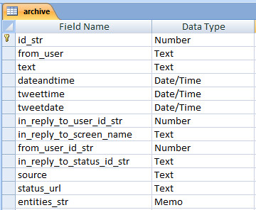
I used MS Access for the main analysis. I know a bit of SQL from way back, and Access is pretty readily available. I imported all of the sheets into a single table, called archive. I had already created a separate table called users, which contained information about each account. The table structure for the archive table was pretty much determined by Twitter’s data structure.

archive

Data structure. The Tweetdate and Tweettime fields were added later.

I used Access’s inbuilt tools to remove duplicates from the archive. TAGS has a function to do this in the Google Sheet, but the files were so large the script was battling, so I opted to do it once I had a full archive.

Twitter provides a date/time stamp for all Tweets, in a single field, formatted “Fri Sep 12 11:56:48 +0000 2014”. I split this field into two new fields, one date, one time, by copying the field and then using Access’s field formatting to strip the time and date out respectively. I then filtered all tweets by dates on which the trial was in session (based on this Wikipedia article, I confess, but I did check that this tallied with the data I had). I also filtered the Tweets by time, limiting the archive to time between 9am and 5pm, South Africa times (Twitter’s timestamp is universal time). I then read through the feeds, and removed any days in which it was clear thejournalist was not in the courtroom. I also removed a large number of Tweets from the official news organisation accounts (in retrospect, I wouldn’t include this if I did it again) that were not about the trial. I initially intended to filter by hashtags, but hashtag usage was inconsistent, to say the least, so this didn’t work.

That left me with around 80 000 Tweets to play with. I did some basic select queries to pull out volume of Tweets per day, and per user per day, pasted into Excel and made charts.

I then pulled the text of tweets, converted to json using this tool and then used Marco Bonzanini’s excellent tutorial on mining tweets with Python and the NLTK to extract hashtags from the corpus.

Mentions and retweets are harder to analyse. Twitter does store replies as metadata, but not retweets. The NLTK can’t work with two-word terms (or I couldn’t work out how to do this), so they can’t be counted. I replaced all occurrences of “RT @” with “RTAT” (after first checking whether that string occurred anywhere else within the corpus) and then used the NLTK to analyse all terms starting with RTAT, to extract most popular retweetees.

It was simpler to extract 24 separate JSON files for each user, and run the same analysis again than to iterate the code (my Python skills are woefully bad), so I did that.

Links to images are stored in the “entities” metadata with the media tag, but this field is too long to be stored as text in Access, so it can’t be easily analysed – it can be filtered, but not queried, for reasons I don’t understand. I filtered by the media tag, and exported to CSV where I used Excel to select a random set of images to analyse. These had to then be manually viewed on the web to conduct the analysis.

Links were likewise extracted from the metadata by filtering, exporting to Excel and using Excel’s matching tools to extract the actual URLs. Links are shortened in the text, but in most cases the meta tag retains the full URLs. In some cases, the URL in the metadata is again shortened, and I used Python to extract the full URLs and then updated the table with the correct URL. These were then analysed in the database, and tagged by type manually. (I could have done this automatically, but there are times when doing something manually is quicker and simpler than automating the code).

Queries were used to extract numbers of various occurrences and exported to Excel to generate graphs and charts.

I know there are better and more efficient ways to do all of this, but focusing on what works is what matters to me most of the time.

Education data in the media

This is a paper I am presenting at The Politics of Reception – Media, Policy and Public Knowledge and Opinion at Lancaster University, April 20th and 21st 2016.

The slides go into possible responses in more depth. They are available here.

All the data that’s fit to print: an analysis of the coverage in national newspapers of the 2013 PISA Report.  

Megan Knight, Associate Dean, School of Creative Arts, University of Hertfordshire.

Data is increasingly part of the public discourse, and how public bodies present information to the news media (and through them, to the public). Drawing on previous work on the subject (Knight, 2015), this paper analyses the presentation of one set of this data in the media, and is working to develop possible responses on the part of the data’s authors.

A total of 34 articles were analysed, from ten news outlets, including websites. Coverage ran over over a week, with the first article running before the release of the report, on December 1st, and the last on the 6th. The full text of the articles was retrieved from Nexis, and letters to the editor and duplicates were removed. Articles came from both the print and online outlets of the various news organisations.

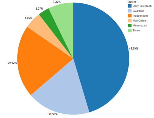
The Telegraph published the most articles, 16, including an online feature that contained within it nine short pieces, each highlighting an aspect of the results. The Guardian and the Independent had seven articles each, The Times three, and the Daily Mail and Mirror one each. By word count, the ratio is similar, although the Daily Mail article was twice the length of that of the Mirror, so it is a larger proportion of coverage.

figure one

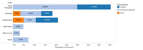
What is more interesting is the nature of the coverage. 53% was editorial or commentary, 19% analysis and only 28% was straight news reporting. Only two outlets, the Guardian and Independent, had a single report that simply announced the results, without comment or analysis. Only the Telegraph, Guardian and Independent reproduced any part of the data included in the report.

figure two

On analysing the overall coverage, an initial read-through of the Pisa Report was conducted (OECD, 2013), and the key concepts from the report were identified and tabulated. These might be expected to appear in the coverage of the report and are as follows: The range of subjects covered by the report, including Maths, Reading, Science, Problem Solving and Financial literary; Gender bias evidenced by the data; socio-economic factors that had an impact on performance; the relationship of the results to economic growth; the proportion of immigrant children in the classroom; the importance of motivation and culture to performance; expenditure on education; stratification of education (streaming) and teacher compensation.

figure three

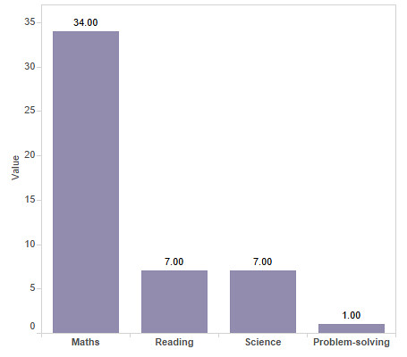
Of the four sections on the test, only one, Maths, was discussed in all the reports, Science and Reading were discussed in seven, Problem-Solving in one, and none of them mentioned Financial Literacy, a new area of study for the PISA report. 26 of the reports, 76% of the whole, only discussed the maths scores, and implied that the test was simply one of mathematical literacy. Of the eight that did discuss other aspects of the test, five did so in less than a sentence. The one report that did discuss problem-solving, an area of the test that the UK did well on, was an opinion piece by a Hong Kong schoolteacher, discussing concerns that future entrepreneurs in the city were being stifled by rote learning and test-taking in favour of softer skills.

figure four

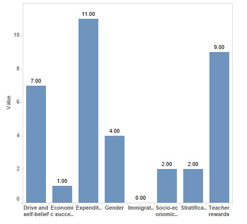
Coverage of the section of the report that discusses the relationship between the scores and other factors, including gender, socio-economic factors, economic growth, immigration, the culture of learning, expenditure on education, the stratification of the education system and teacher compensation was then analysed. Expenditure was discussed in eleven of the articles, in two, the implication was that the UK should spend more on education, in the others, the implication was strongly that the UK’s relatively low standing was despite its high spending. This is interesting, because although the UK spends a relatively large amount to educate each child (ninth in the rankings), the amounts are not adjusted for actual purchase value of currency, and the link was often presented in a negative light:“extra spending is no guarantee of higher performance, good news in an era of austerity” (Barber, 2013) Teacher rewards (financial and status) were mentioned in nine reports, but only one linked the UK’s performance with these issues in the UK.

The culture of education, including the drive and motivation of students was mentioned in seven reports, most often as a reason for the success of Asian countries. Gender was discussed or mentioned in four reports. Stratification and socio-economic factors were mentioned twice each, and immigration was never mentioned at all.

But, it is clear from the analysis that presenting the results of the Pisa report was not the main focus of the coverage. More than half of the coverage was in the form of editorial (written by the news organisation’s staff) or commentary (written by guest columnists). Ten of the articles explicitly politicised the issue, blaming the results on either the then-current government, or on the previous one. Fifteen of the articles presented the results in a negative light, using phrases such as “Britain is failing”, “fall down education league”, “stuck in the educational doldrums”, and “going backwards”. This despite the fact that the results are ambiguous, the UK’s ranking had increased slightly overall since 2009, and the country had done well on at least one measure of the test, problem-solving.

Eight of the articles presented the idea that Asia is “winning” the educational contest (as though education is a zero-sum game), in contrast to the UK’s “losing” of the same contest. Again, this is despite the fact that several non-Asian countries outperformed the UK as well.

Only three stories offered any critique of the study. Critiques were focused on the use of “plausible data” to fill in gaps and on the selection of Shanghai as a testing location. Minor critique was offered in two other articles, in the form of a caveat “academics question the validity of the test”, and four more criticised the ways in which various societies respond to the findings, accusing the test of effectively narrowing the range of debate on education policy and reinforcing a culture in which one’s maths scores are paramount. In only one of these articles did the journalist engage specifically with the data, and conduct their own analysis.

This politicisation of the issues is presented in line with the known political bias of the newspapers in question – the data was framed almost entirely in the context of the political landscape and the impact of the coalition government’s reforms of the education system in the UK.

None of this is surprising: education policy is highly political, and new information that reflects on that policy will inevitably be turned to political ends. The rhetoric of failure, of international standards as competition with winners and losers, and of the threat of economic (and possibly other) damage which may be wrought by China are established tropes in the UK news media, and the coverage here falls into a familiar pattern of blame and self-criticism.

So, what does this mean for academics and people working with this data, and wanting to ensure fair and useful coverage in the media? Much of the material below is based on well-accepted research into news values (Galtung and Ruge, 1965; Harcup and O’Neill, 2001), which discussed the ways in which news organisations make choices of stories and angles.

newspapers 1png

Journalists are superficial thinkers.

This is not an insult. Journalists tend to have a very wide range of knowledge and expertise, and to pick things up very quickly, but the converse of that is that they do not have the time (or often the inclination) to develop expertise and in-depth understanding of information. The report was released on December 3rd, and the first reports appeared the same day. Even allowing for early release to the media, it is likely that the journalists had only a day or two with the report, whose short form is 44 pages long and contains dozens of detailed and complicated tables, before needing to file their stories.

Every news organisation leapt on a single key point: the maths scores. This is in keeping with the main thrust of the report, and also with previous reporting on the issue. Since the report was expected, it is also likely that the news organisations prepared much of the material in advance, lining up experts and commentary before they knew what the results would be.

newspapers 2
Journalists (and readers) are uncomfortable with ambiguity.

Although the results are subtle, and the question of whether the UK has risen or fallen in the rankings is a complicated one, the final message was presented as a simple failure to improve. This is partially the result of the politicisation of the issue, partly the need for clear headlines.

Research is seldom simple, and the news media’s taste for unambiguous results and simple statements makes journalists and academics uncomfortable bedfellows. Academics are often frustrated with what they see as misrepresentation, and journalists with what they see as waffling or prevarication.

newspapers 3

Journalists are frightened of data.

The fact is, maths and data scare journalists, who tend to be drawn from the ranks of those who hated maths at school. The way in which data are presented in reports like the PISA report is particularly complicated, for academics, it can be hard to realise that any representation of data containing more than two value scales is baffling. [Insert figure 11.1.2 from p 14 of the report].

The stories were based almost entirely on the text contained in the press release and the narrative of the report, any information not conveyed in a simple skim of the report was not present in the coverage.

newspapers 4

Journalists rely on other people.

Journalists are trained not to voice their own opinions. The convention is still to use third parties, expert voices and commentary, to present arguments in a story. Obviously the journalist has control over who they interview, and can privilege one opinion over another in this process, but in practice, comment tends to come from the people the journalist knows and can trust to provide what is needed, in the right time frame. Researchers and academic staff are commonly used in interviews, and often actively court relationships with journalists.

In addition, some 40% of the articles presented were not written by journalists, but commissioned from experts and interested parties to present a range of perspectives and voices. This form of writing can be an excellent vehicle for academics and researchers to raise their profile and present their own research, again, provided they work within the known parameters of the news organisation.

Conclusions and issues.

  • Small increase in data journalism and data journalists
    • Costs and specialisations
  • Impact on policy
    • Cherrypicking and retrospective justification
  • Do journalists really matter?
    • Direct access to public opinion via social media


Works Cited

Galtung, J., Ruge, M.H., 1965. The Structure of Foreign News. J. Peace Res. 2, 64–91.

Harcup, T., O’Neill, D., 2001. What Is News? Galtung and Ruge revisited. Journal. Stud. 2, 261–280. doi:10.1080/14616700118449

Knight, M., 2015. Data journalism in the UK: a preliminary analysis of form and content. J. Media Pract. 16, 55–72. doi:10.1080/14682753.2015.1015801

OECD, 2013. PISA 2012 Results in Focus.


A Crisis in Numbers: data visualisations in the coverage of the 2015 European refugee crisis.

Notes for talk given for the Interactive Design Institute in London, October 2nd.

A few years ago I did a study on data journalism in UK newspapers. This grew out of work I had done in training students and journalists in data analysis and visualisation techniques. In that paper I discussed the varying approaches and techniques used in data journalism in print, and looked at developing a mechanism for measuring data journalism. (Knight, 2015)
I was asked to speak today based on this paper. I tend to get frustrated with work once it has been published, and get rather into the “never want to see or think about that again” mode, so I suggested a different title: A Crisis in Numbers: data visualisations in the coverage of the 2015 European refugee crisis. I suggested that because it was early August, and the news media had been full of the crisis, and there was a wide range of data analysis and visualisations evident in the media at that time.
I began collecting examples, but I confess it wasn’t intended as a definitive or comprehensive analysis, so I have not been as thorough as I was in the previous study. I also began to be more interested in the kinds of ideas or stories that were being represented in the visualisations, rather than the specifics and technicalities of the actual images and presentation. I ended up focusing only on a handful of publications – The Economist and New York Times were the richest sources, the Guardian and Telegraph offered some data, and I found very little else.
Based on a rough and instinctive analysis, I have extracted some themes that are evident in the examples I have. Again, this is rough, part of the process of developing ideas around analysing data journalism.
Origins:
Although the events of this summer are commonly referred to as the “Syrian refugee crisis”, it is clear that the refugees leaving the Mediterranean come from a wide range of countries, not only from Syria. A handful of visualisations looked at the origins of the refugees, but surprisingly, this was quite limited. One of them was based on year-old data, and somewhat misleading given the context of the story.

From: http://www.telegraph.co.uk/news/worldnews/europe/eu/11883027/What-is-the-difference-between-a-refugee-a-migrant-and-an-asylum-seeker.html

(Swidlicki, 2015)
The only other visualisation showing origin was part of a much larger piece, showing overall patterns in refugee migration globally. This was a more comprehensive image which showed origins and destinations of refugees globally. Although the image is striking, it’s not readily comprehensible.

From: http://www.nytimes.com/interactive/2015/06/21/world/map-flow-desperate-migration-refugee-crisis.html

(Peçanha and Wallace, 2015)
Routes:
The route refugees take from their country of origin to their final destination was a more widely reported aspect of the story – given that teh majority of refugees where coming through Eastern and Southern Europe, but aiming to get to Northern and Western Europe, this journey , and obstacles along it were a key aspect of the story.

From: http://www.economist.com/blogs/graphicdetail/2015/09/migration-europe-0

(“Time to go,” 2015)
The Economist’s map showing routes, entry points and way stations gives a good sense of the momentum of travel, and some of the border controls and areas that affected desired routes and destinations.

From: http://www.nytimes.com/interactive/2015/06/09/world/migrants-global-refugee-crisis-mediterranean-ukraine-syria-rohingya-malaysia-iraq.html

(Boehler and Peçanha, 2015)
The New York Times’ map shows one area in more detail, has more of a narrative feel to it. It’s telling the story with detail to flesh it out, rather than explaining the context and impact.
Incidents and Deaths: 

From: http://www.theguardian.com/world/ng-interactive/2015/sep/18/latest-developments-in-europes-refugee-crisis-a-visual-guide

(Jeffery et al., 2015)
The Guardians’ map of incidents along the route doesn’t show destinations, strictly speaking (it assumes one knows the context), but highlights specific events. Again, this is the use of a visualisation to identify and clarify a narrative, rather than illuminate or explain a phenomenon.

From: www.nytimes.com/interactive/2015/06/09/world/migrants-global-refugee-crisis-mediterranean-ukraine-syria-rohingya-malaysia-iraq.html

(Boehler and Peçanha, 2015)

The New York Times map of the Mediterranean, showing sinkings and deaths is a much starker indication of one aspect of the crisis, although it lacks the context of time.

From: http://www.economist.com/blogs/graphicdetail/2015/09/migration-europe-0

(“Death at sea,” n.d.)
The Economist’s approach to similar (if not identical) data is a much more straightforward line graph which gives a far better sense of the scale of the crisis.
Destinations:
By far the largest proportion of the material shown focused on destinations of migrants, especially within Europe. Both the Economist and New York Times produced maps showing the impact of Syrian refugees on neighbouring countries. The Economist is not clear, but these two maps seem to based on the same data on the base map. The Economist has complicated and confused the map somewhat with more dimensions and a graded colour key.

From: http://www.economist.com/blogs/graphicdetail/2015/09/migration-europe-0

(“Time to go,” 2015)

From: www.nytimes.com/interactive/2015/06/09/world/migrants-global-refugee-crisis-mediterranean-ukraine-syria-rohingya-malaysia-iraq.html

(Boehler and Peçanha, 2015)

The Economist also produced a complex (but more readable) visualisation showing the destinations of Syrian refugees and the proportion of the receiving countries’ population they represent.
Both this visualisation and the two previous ones clearly show that Syria itself, and neighbouring countries are bearing far more of the burden of the problem than even highly-affected European countries like Austria and Italy.

From: http://www.economist.com/blogs/graphicdetail/2015/09/daily-chart-crisis-context

The New York Times visualisation of the overall destinations of refugees, although it shows the local effect, tends to emphasise the impact on North America and Northern and Western Europe simply by the way the eye is drawn to the longer lines and dramatic sweeps.

From: http://www.nytimes.com/interactive/2015/06/21/world/map-flow-desperate-migration-refugee-crisis.html

(Boehler and Peçanha, 2015)

The Guardian opted for a much simpler visualisation which initially seems based on a treemap, but has some variation. What it does show well is the relative size of the refugee populations, and the impact of that within each country.

From: http://www.theguardian.com/world/ng-interactive/2015/sep/18/latest-developments-in-europes-refugee-crisis-a-visual-guide

(Jeffery et al., 2015)
The Telegraph focused on a handful of countries, showing relative numbers of asylum applications.

From: http://www.telegraph.co.uk/news/worldnews/europe/11884051/Foreign-Secretary-refugee-crisis-is-good-for-UK-renegotiation.html

(Holehouse, 2015a)
Fairness and quotas:

The issue of fairness, of whether the world was dividing up the burden equally became a dominant narrative of the discussion towards the end of August. A number of visualisations were developed that looked at this issue.
The Telegraph had a simple graph showing the size of the quota for each country:

From: http://www.telegraph.co.uk/news/worldnews/europe/11884051/Foreign-Secretary-refugee-crisis-is-good-for-UK-renegotiation.html
From: http://www.telegraph.co.uk/news/worldnews/europe/eu/11882355/Refugee-crisis-EU-migrant-refugee-quota-UN-ministers-meet.html

(Holehouse, 2015b)
They also showed bubbles showing the relative size, with details of where the refugees were currently residing.

From: http://www.telegraph.co.uk/news/worldnews/europe/eu/11882355/Refugee-crisis-EU-migrant-refugee-quota-UN-ministers-meet.html

(Holehouse, 2015b)

The Guardian showed both numbers and proportion of population.

From: http://www.theguardian.com/world/ng-interactive/2015/sep/18/latest-developments-in-europes-refugee-crisis-a-visual-guide

(Jeffery et al., 2015)
The issue of whether countries would take more or fewer if the quotas went ahead was also presented. The NYT’s map highlights some of the differences in Europe.

From: http://www.nytimes.com/interactive/2015/09/04/world/europe/europe-refugee-distribution.html

(Boehler and Peçanha, 2015)
The same data was used to show the specifics of how much under and over quota countries were:

From: http://www.nytimes.com/interactive/2015/09/04/world/europe/europe-refugee-distribution.html

(Boehler and Peçanha, 2015)
The New York Times also chose to look at GDP as well as size and number of refugees, and produced this:

From: http://www.nytimes.com/interactive/2015/09/04/world/europe/europe-refugee-distribution.html

(Boehler and Peçanha, 2015)
Final comments:
There were some issues that were clear on observation. The timeframe of data was never clear, and given that this is not a single event, but a surge in an ongoing movement, this is really problematic.
None of the visualisations clarified what was meant by refugees or migrants, and several were unclear on the data’s origins, making it hard to verify.
Overall, the Guardian was a disappointment (what happened to the Guardian’s data team and blog?), the Telegraph was limited and simplistic, the Economist complicated and in-depth and the New York Times both nuanced and visually powerful (although the spot colour orange and purple was a bit much after a while).

References:
Boehler, P., Peçanha, S., 2015. The Global Refugee Crisis, Region by Region. N. Y. Times.
Death at sea, n.d. . The Economist.
Holehouse, M., 2015a. Britain faces £150m cost for EU migrant crisis.
Holehouse, M., 2015b. EU quota plan forced through against eastern European states’ wishes.
Jeffery, S., Scruton, P., Fenn, C., Torpey, P., Levett, C., Gutiérrez, P., Jeffery, S., Scruton, P., Fenn, C., Torpey, P., Levett, C., Gutiérrez, P., 2015. Europe’s refugee crisis – a visual guide. The Guardian.
Knight, M., 2015. Data journalism in the UK: a preliminary analysis of form and content. J. Media Pract. 16, 55–72. doi:10.1080/14682753.2015.1015801
Peçanha, S., Wallace, T., 2015. The Flight of Refugees Around the Globe. N. Y. Times.
Swidlicki, P., 2015. This East-West split over EU refugee quotas will have long-lasting consequences.
Time to go, 2015. . The Economist.

Data Journalism research

So, I’ve finished the data journalism project, first tranche. As expected, there’s not a lot of data journalism really evident in two weeks’ of national daily newspapers, but there are some interesting things.

Scarily, the only large “investigative” pieces came from the tabloids, and only one of those was not an insult to the intelligence. The Mirror did a piece based on an FOI request looking at STD infection rates in young people. Interesting idea, but the data was not really discussed properly, and the graphics were appalling. Using a condom as a graphic element is fine; trying to show changes over three years in a pie chart because you are wedded to the condom idea is not.

Sti graphic-1777871

The other two were a horrifically dishonest Mail on Sunday story called “The Great Green Con”, which had been thoroughly discredited by the end of the day, and contains one graph without proper sourcing or readily identifiable figures:
article-2294560-18B8846F000005DC-184_634x427

and an “investigation” by the Sun into psychic phenomena, which turned out to be a reader poll on whether they believe in ghosts or have ever consulted a psychic, accompanied by the UGLIEST infographic ever.
Crys_M_1689083a

So, data journalism, only practiced by charlatans and liars for the edification of fools.

Read the full paper here, if you like.

How big is your network

So, I’m doing another Coursera course, this one on Social Network Analysis. So far, so good, we’ve learnt a bit of the terminology (nodes and edges), and of the software, Gephi. The first assignment was to analyse our own social networks, based on Facebook, which was fun, but also frustrating.
network
This is my network of Facebook friends, based on my personal account. I have a lot of random people, it seems, or barely connected groups of two or three. The big glob (technically known as the “giant component”) in the middle is my online friends, then the arc consists of clumps (strongly connected components) of Rhodes University on the bottom left, moving into South African journalists and friends generally, then my UCLan friends, the next cluster are Canadian friends, high school, then university, Dubai is next, and the last clump is, oddly, people from Tshwane University in Pretoria, none of whom seem to have any connection with Rhodes University and my Joburg network. It’s most odd.

Sprinkled throughout are individuals I have picked up along the way.

It’s an interesting exercise, looking at your network this way, and seeing how you connect to people. In the software, you can move things around, and change sizes and colours, as well as seeing the names of the people each circle (node) represents.

Social Network Analysis on Coursera

The course is free, online, and lasts nine weeks. You can get a certificate if you do all the work, or you could just watch the videos and play with the software.